Boxplot: Election to Inauguration
This box plot (also known as box and whiskers) is laid out for the time period of each President's "election to inauguration" in chronological order, from President H.W.Bush through President Donald Trump. The far right shows the Dow Jones Index from January 3, 2001 through September 27, 2019.
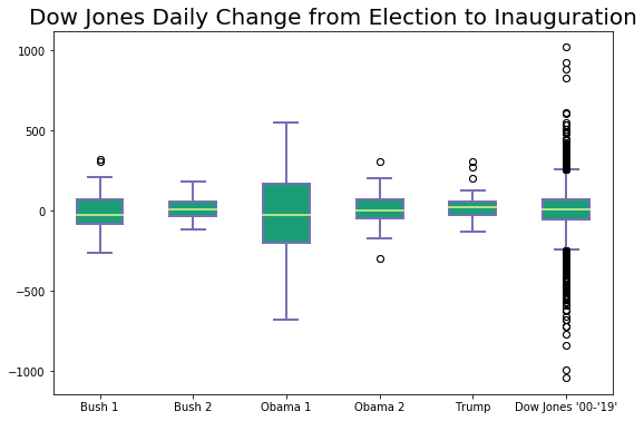
The dark green boxes display the 50th percentile of data with the light green line representing the mean.
The whiskers indicate the 75th percentile on the top and the 25th percentile on the bottom.
The black circles are the outliers.
The means of each box are relatvely the same across all of these. There is some variation in the box sizes and the whiskers. One thing to keep in mind on this plot is that the "election to inauguration" time period of one president is during the previous president's term (or the previous term of the same president in the case of a second term). The largest 50th percentile box is during President Obama's first election, and that is the same time period of the depression (Nov. 2008 - Jan. 2009).